When to use this
- You need a chat header for a user or group conversation.
- You want typing indicators and presence in the header.
- You want to customize the title or back button.
Prerequisites
- CometChat React UI Kit v6 installed:
@cometchat/chat-uikit-react. CometChatUIKit.init()andCometChatUIKit.login()complete before rendering.- Provide either
userorgroup(not both).
Quick start
- Add the component to your UI.
- Verify the component renders after
init()andlogin().
Core concepts
- Pass
userfor 1:1 orgroupfor group chats. hideBackButtonandhideUserStatuscontrol header UI.
Implementation
AI Agent Component Spec
AI Agent Component Spec
- Package:
@cometchat/chat-uikit-react - Import:
import { CometChatMessageHeader } from "@cometchat/chat-uikit-react"; - Minimal JSX:
<CometChatMessageHeader user={chatUser} />or<CometChatMessageHeader group={chatGroup} /> - Required setup:
CometChatUIKit.init(UIKitSettings)thenCometChatUIKit.login("UID") - Key props:
user: CometChat.User,group: CometChat.Group,hideBackButton: boolean,hideUserStatus: boolean - CSS class:
.cometchat-message-header
Overview
What you’re changing: Overview. Where to change it: Component props or CSS as shown below. Default behavior: UI Kit defaults. Override: Use the examples in this section. Verify: The UI reflects the change shown below.MessageHeader is a Component that showcases the User or Group details in the toolbar. Furthermore, it also presents a typing indicator and a back navigation button for ease of use.

Before using this component: Ensure
CometChatUIKit.init(UIKitSettings) has completed and the user is logged in via CometChatUIKit.login("UID"). See React.js Integration.MessageHeader is comprised of the following components:
| Component | Description |
|---|---|
| CometChatListItem | This component’s view consists of avatar, status indicator , title, and subtitle. The fields are then mapped with the SDK’s user, group class. |
| Back Button | BackButton that allows users to navigate back from the current activity or screen to the previous one. |
Usage
What you’re changing: Usage. Where to change it: Component props or CSS as shown below. Default behavior: UI Kit defaults. Override: Use the examples in this section. Verify: The UI reflects the change shown below.Integration
- TypeScript
- JavaScript
Actions
Actions dictate how a component functions. They are divided into two types: Predefined and User-defined. You can override either type, allowing you to tailor the behavior of the component to fit your specific needs.1. OnBack
OnBack is triggered when you click on the back button of the Message Header component. You can override this action using the following code snippet.
Example
In this example, we are employing the onBack action.
- MessageHeaderDemo.tsx
2. OnError
This action doesn’t change the behavior of the component but rather listens for any errors that occur in the Message Header component. Example In this example, we are employing theonError action.
- MessageHeaderDemo.tsx
3. onSearchOptionClicked
TheonSearchOptionClicked event is triggered when the user clicks the search option. It does not have a default behavior. However, you can override its behavior using the following code snippet.
- MessageHeaderDemo.tsx
4. OnItemClick
OnItemClick is triggered when you click on a ListItem of the CometChatMessageHeader component. The OnItemClick action doesn’t have a predefined behavior. You can override this action using the following code snippet.
- MessageHeaderDemo.tsx
Filters
Filters allow you to customize the data displayed in a list within aComponent. You can filter the list based on your specific criteria, allowing for a more customized. Filters can be applied using RequestBuilders of Chat SDK.
The MessageHeader component does not have any exposed filters.
Events
Events are emitted by aComponent. By using event you can extend existing functionality. Being global events, they can be applied in Multiple Locations and are capable of being Added or Removed.
The MessageHeader component does not produce any events.
Customization
What you’re changing: Customization. Where to change it: Component props or CSS as shown below. Default behavior: UI Kit defaults. Override: Use the examples in this section. Verify: The UI reflects the change shown below. To fit your app’s design requirements, you can customize the appearance of the Message Header component. We provide exposed methods that allow you to modify the experience and behavior according to your specific needs.Style
To customize the appearance, you can customise css ofCometChatMessageHeader
Example

- TypeScript
- CSS
Functionality
These are a set of small functional customizations that allow you to fine-tune the overall experience of the component. With these, you can change text, set custom icons, and toggle the visibility of UI elements. Here is a code snippet demonstrating how you can customize the functionality of the Message Header component.- TypeScript
| Property | Description | Code |
|---|---|---|
| Show Back Button | Shows the back button. | showBackButton={true} |
| Hide Video Call Button | Hides the video call button. | hideVideoCallButton={true} |
| Hide Voice Call Button | Hides the voice call button. | hideVoiceCallButton={true} |
| Show Conversation Summary Button | Shows the conversation summary button. | showConversationSummaryButton={true} |
| Hide User Status | Hides the user’s online/offline status indicator. | hideUserStatus={true} |
| Show Search Option | Shows the search option. | showSearchOption={true} |
| User | A CometChat.User object representing the user whose information (e.g., status) is displayed. | user={chatUser} |
| Group | A CometChat.Group object representing the group whose details (e.g., member count) are displayed. | group={chatGroup} |
| Summary Generation Message Count | Number of messages for which the summary should be shown. | summaryGenerationMessageCount={1000} |
| Disable Auto Summary Generation | Disables the auto generation of conversation summary. | disableAutoSummaryGeneration={true} |
Advanced
For advanced-level customization, you can set custom views to the component. This lets you tailor each aspect of the component to fit your exact needs and application aesthetics. You can create and define your views, layouts, and UI elements and then incorporate those into the component.ItemView
The customized chat interface is displayed below.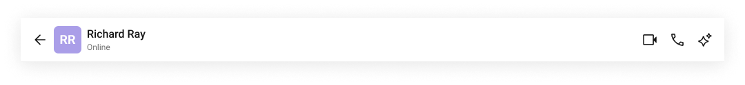
- TypeScript
- CSS
TitleView
The customized chat interface is displayed below.
- TypeScript
- CSS
SubtitleView
The customized chat interface is displayed below.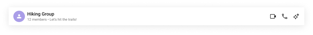
- TypeScript
LeadingView
The customized chat interface is displayed below.
- TypeScript
- CSS
TrailingView
The customized chat interface is displayed below.
- TypeScript
- CSS
AuxiliaryButtonView
The customized chat interface is displayed below.
- TypeScript
- CSS
LastActiveAt Date Time Format
ThelastActiveAtDateTimeFormat property allows you to customize the last active timestamp displayed in the message header.
Default Date Time Format:
CalendarObject.
- TypeScript
Fallback Mechanism
- If you do not pass any property in the CalendarObject, the component will first check the global configuration. If the property is also missing in the global configuration, it will fallback to the component’s default formatting.
Common Failure Modes
Common Failure Modes
| Symptom | Cause | Fix |
|---|---|---|
| Component doesn’t render | CometChatUIKit.init() not called or not awaited | Ensure init completes before rendering. See Methods |
| Component renders but shows no data | User not logged in | Call CometChatUIKit.login("UID") after init |
| Typing indicator not showing | No active typing in the conversation | Typing indicator appears only when the other user is actively typing |
| Back button not visible | hideBackButton={true} is set | Remove or set hideBackButton={false} |
| SSR hydration error | Component uses browser APIs on server | Wrap in useEffect or dynamic import with ssr: false. See Next.js Integration |
Customization matrix
| What you want to change | Where | Property/API | Example |
|---|---|---|---|
| Hide back button | CometChatMessageHeader | hideBackButton | hideBackButton={true} |
| Hide status | CometChatMessageHeader | hideUserStatus | hideUserStatus={true} |
| Custom title view | CometChatMessageHeader | titleView | titleView={() => <MyTitle />} |
Common pitfalls and fixes
| Symptom | Cause | Fix |
|---|---|---|
| Header does not render | Init/login not complete | Call CometChatUIKit.init() and login() first |
| Missing name/avatar | User/group not loaded | Fetch CometChat.User or CometChat.Group |
| Both user and group passed | Invalid props | Pass only one of user or group |
FAQ
Can I hide the back button? Yes. UsehideBackButton={true}.
Does it show typing?
Yes. Typing indicators are built in.