When to use this
- You need a list of recent conversations for the logged-in user.
- You want unread counts, last message previews, and typing indicators.
- You want to handle selection or navigation when a conversation is clicked.
- You need to filter conversations by type or tags.
- You want to customize list items, header, and actions.
Usage
Integrate the component
- What you’re changing: Add the conversations list to your UI.
- File:
src/ConversationsDemo.tsx - Applies to:
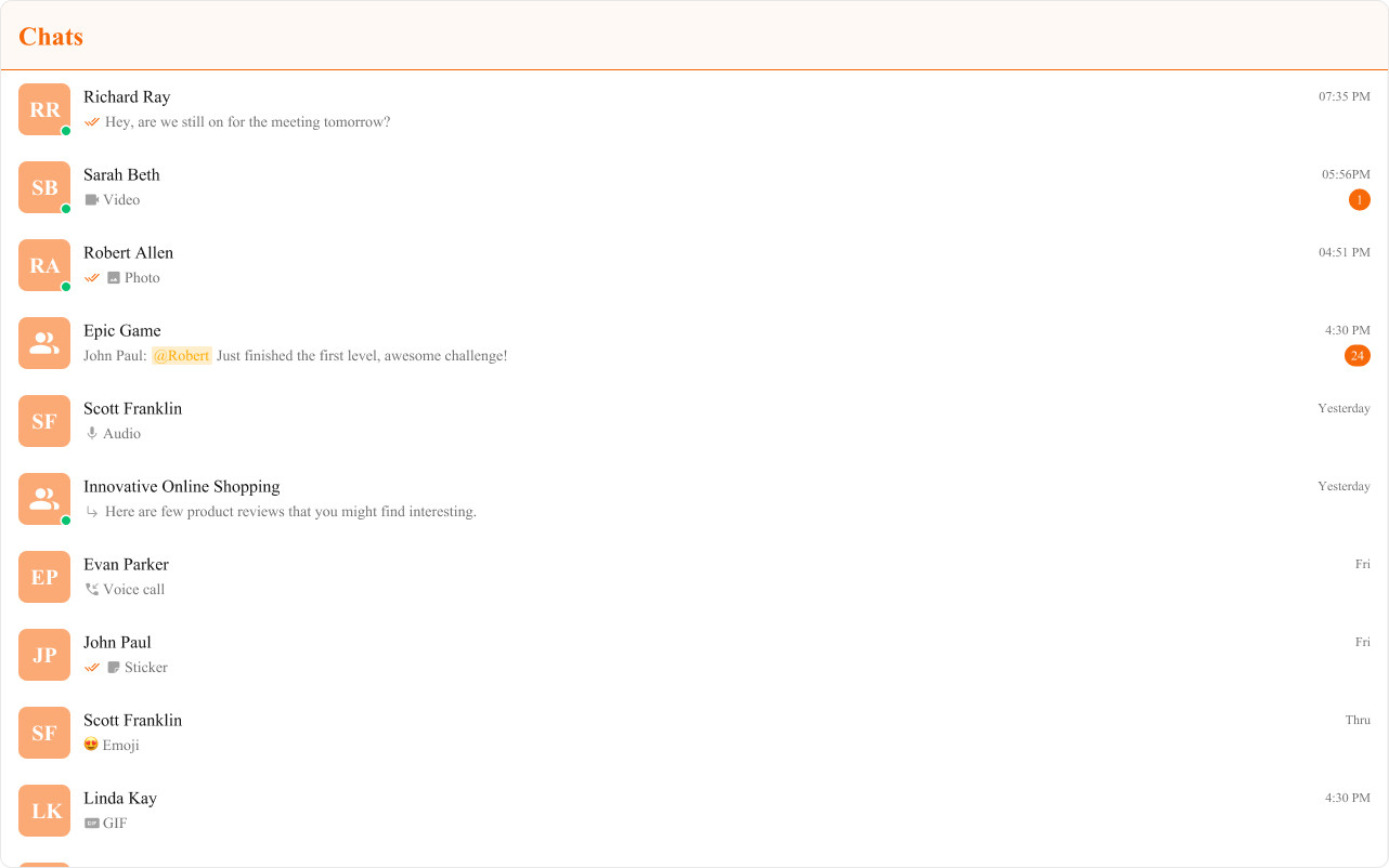
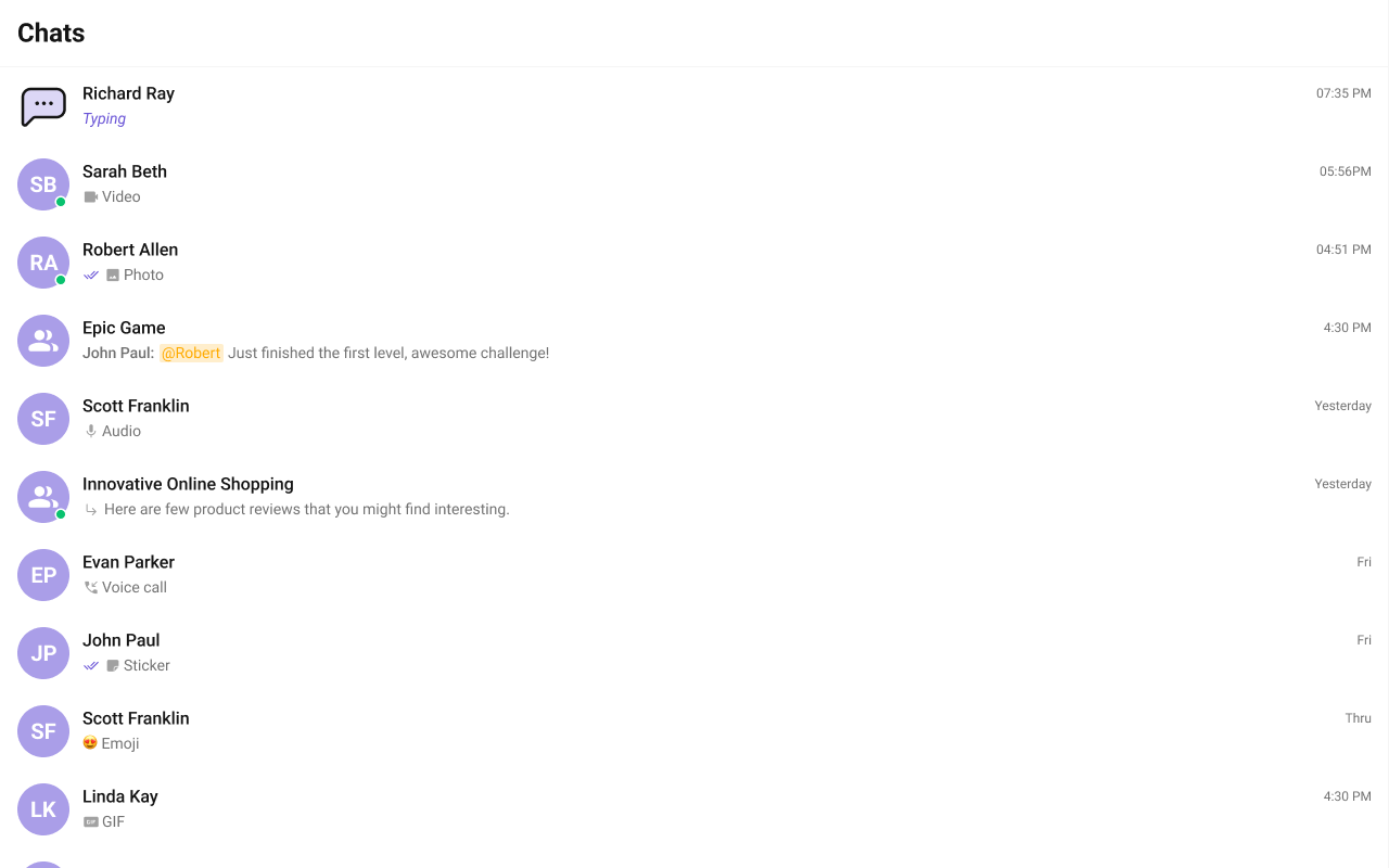
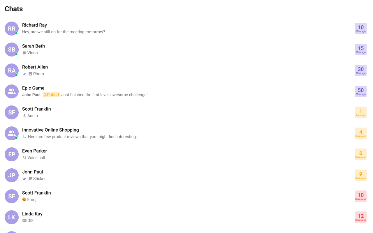
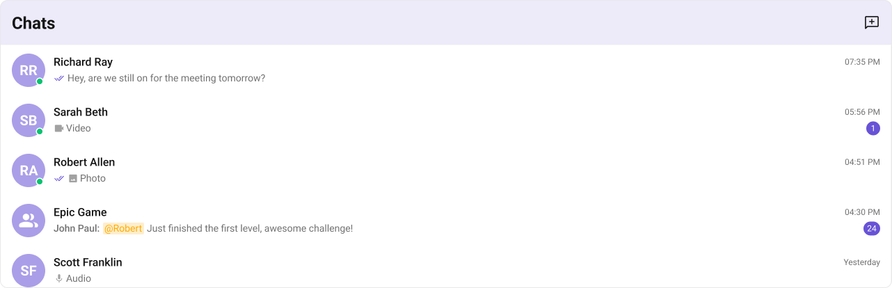
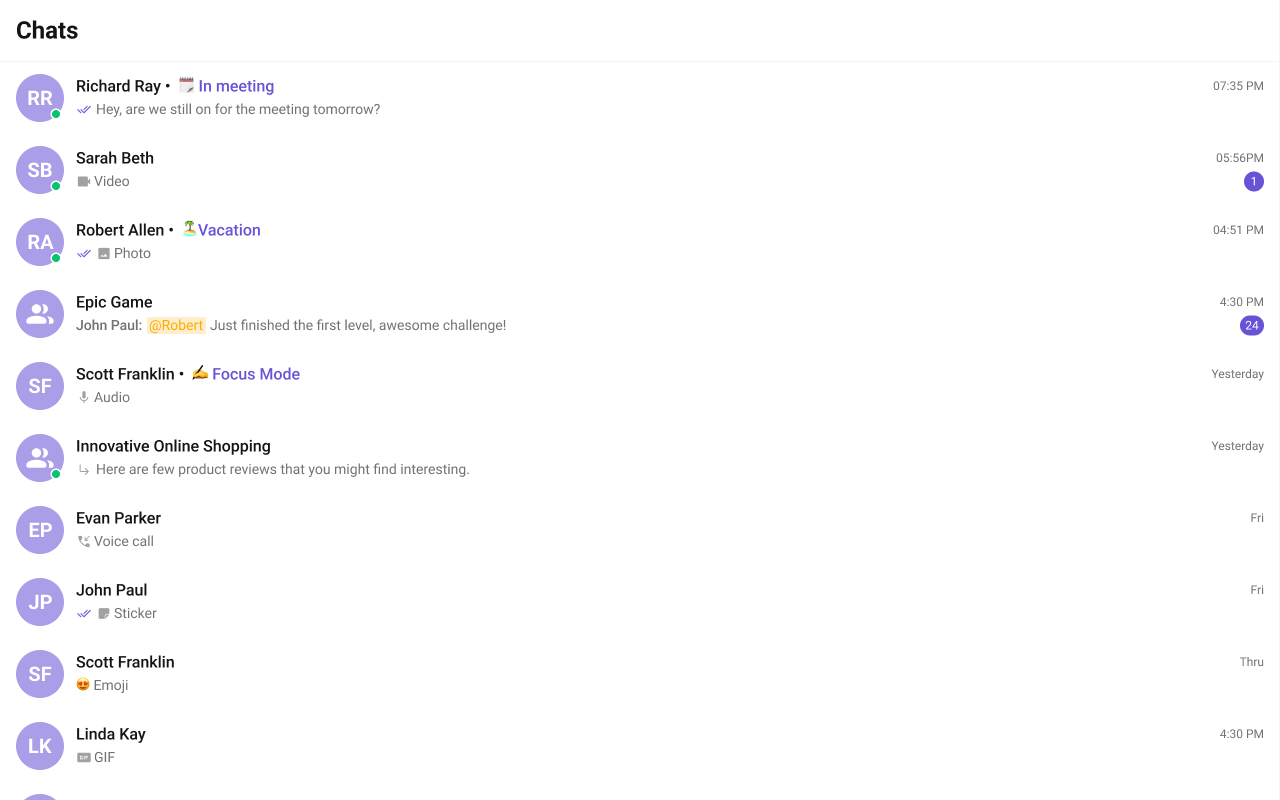
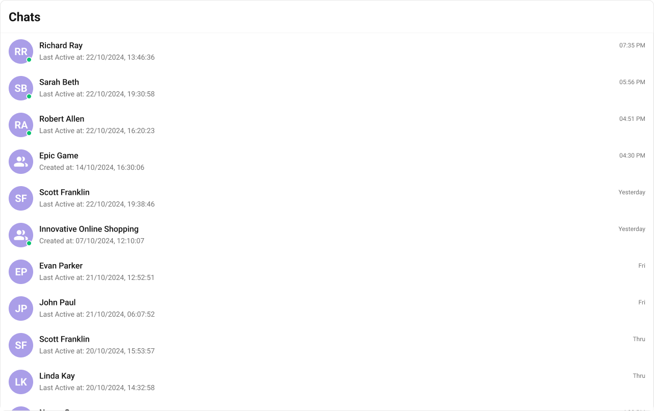
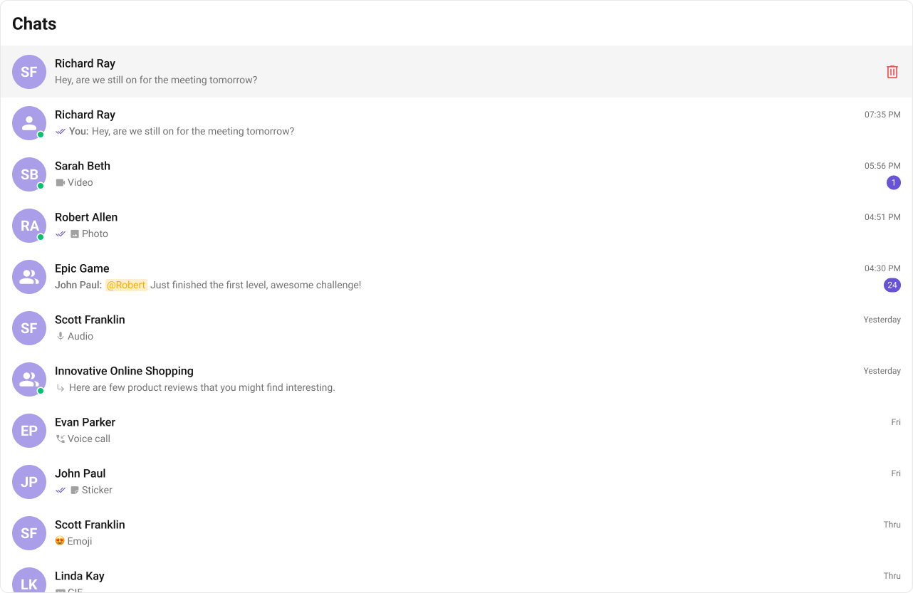
CometChatConversations - Default behavior: Renders a scrollable list of recent conversations.
- Override: Add props such as
onItemClickorselectionMode. - Verify: Conversation tiles render with avatars, names, last messages, and unread counts.
- TypeScript
- JavaScript
Actions
- What you’re changing: Override default behavior by handling component actions.
- File: Any React module
- Applies to:
onItemClick,onSelect,onError,onSearchBarClicked - Default behavior: Actions emit events but do not change your app state.
- Override: Provide callbacks to update your UI or app state.
- Verify: Your handlers run when the action fires.
OnItemClick
- TypeScript
- JavaScript
OnSelect
- TypeScript
- JavaScript
OnError
- TypeScript
- JavaScript
onSearchBarClicked
- TypeScript
- JavaScript
Filters
- What you’re changing: Filter or limit the conversations list.
- File: Any React module
- Applies to:
conversationsRequestBuilder - Default behavior: Fetches default conversation list.
- Override: Use
CometChat.ConversationsRequestBuilderto filter. - Verify: The list respects your limit or filters.
Events
- What you’re changing: Subscribe to conversation events.
- File: Any React module
- Applies to:
CometChatConversationEvents - Default behavior: Events emit globally without app handling.
- Override: Subscribe and react to event payloads.
- Verify: Your handler runs on conversation events.
- Add Listener
- Remove Listener
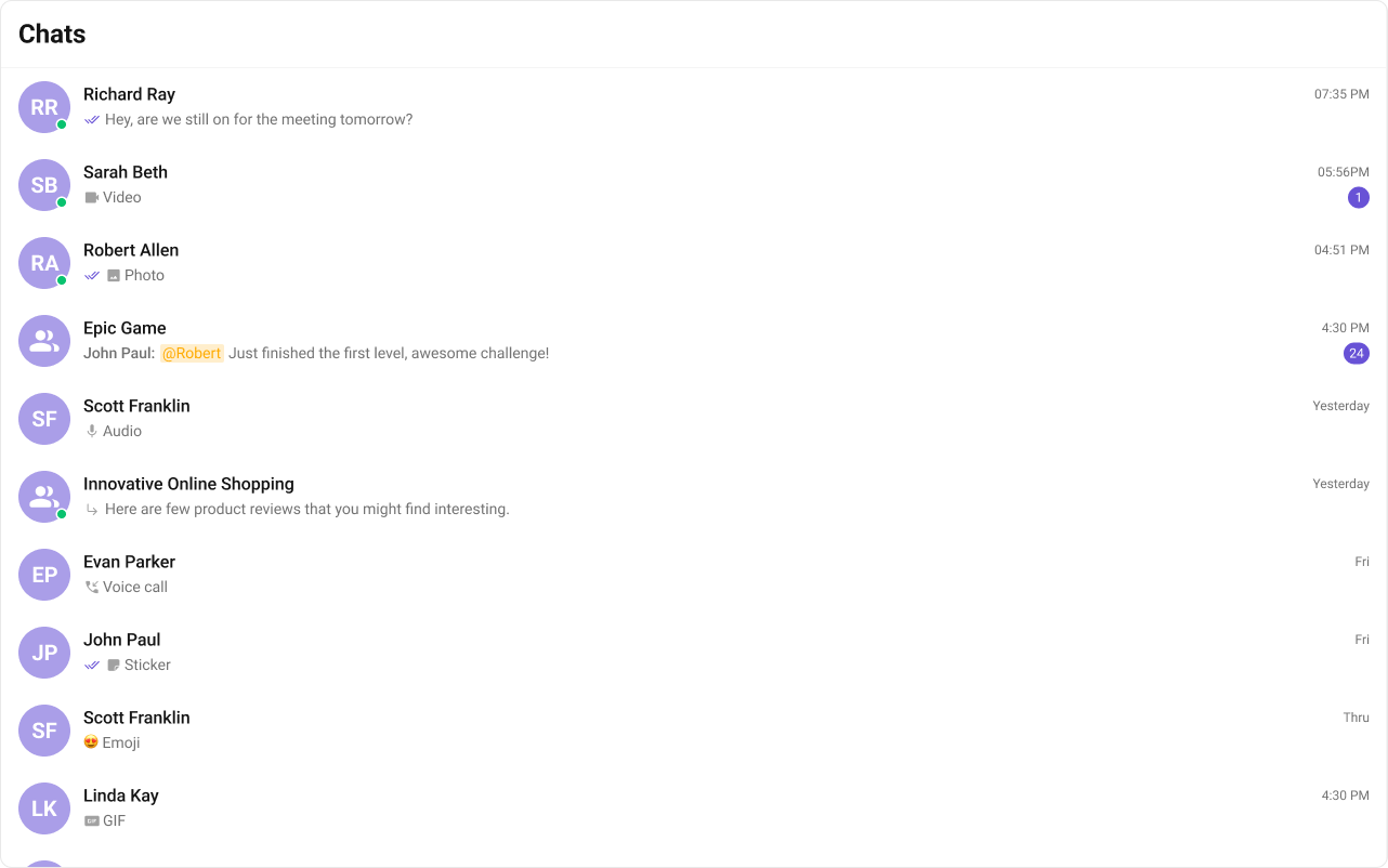
Customization
Style
- What you’re changing: Override CSS for the conversations list.
- File: Global stylesheet (for example
src/App.css) - Applies to:
.cometchat-conversationsselectors - Default behavior: UI Kit default styles.
- Override: Use CSS overrides.
- Verify: Fonts, colors, and badges update.
- TypeScript
- CSS
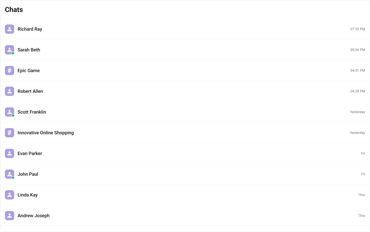
Functionality
- What you’re changing: Adjust built-in UI behavior with props.
- File: Any React module
- Applies to: Conversations props
- Default behavior: UI Kit default behavior.
- Override: Use props listed below.
- Verify: UI changes reflect the prop values.
- TypeScript
- JavaScript
| Property | Description | Code |
|---|---|---|
| Hide Receipts | Disables read receipts in the list | hideReceipts={false} |
| Hide Error | Hides default and custom error views | hideError={true} |
| Hide Delete Conversation | Hides delete action in the menu | hideDeleteConversation={false} |
| Hide User Status | Hides online status indicator | hideUserStatus={true} |
| Hide Group Type | Hides group type icon | hideGroupType={false} |
| Show Search Bar | Shows the search bar | showSearchBar={true} |
| Active Conversation | Highlights the active conversation | activeConversation={activeConversation} |
| Selection Mode | Enables multi-select | selectionMode={SelectionMode.multiple} |
| Disable Sound For Messages | Disables incoming message sounds | disableSoundForMessages={false} |
| Custom Sound For Messages | Custom incoming message sound | customSoundForMessages="Your custom sound url" |
| Search View | Custom search view | searchView={<>Custom Search View</>} |
| Loading View | Custom loading view | loadingView={<>Custom Loading View</>} |
| Empty View | Custom empty state | emptyView={<>Custom Empty View</>} |
| Error View | Custom error state | errorView={<>Custom Error View</>} |
Advanced views
ItemView
- What you’re changing: Replace the default list item with a custom view.
- File: Any React module
- Applies to:
itemView - Default behavior: UI Kit default list item layout.
- Override: Return a custom
CometChatListItem. - Verify: List items render with your custom UI.
- TypeScript
- CSS
LeadingView
- What you’re changing: Replace the leading view (avatar area).
- File: Any React module
- Applies to:
leadingView - Default behavior: Default avatar and status UI.
- Override: Return a custom leading view.
- Verify: The leading area renders your custom UI.
- TypeScript
TrailingView
- What you’re changing: Replace the trailing view (right side of list item).
- File: Any React module
- Applies to:
trailingView - Default behavior: Default timestamp and badge UI.
- Override: Return a custom trailing view.
- Verify: The trailing area renders your custom UI.
- TypeScript
- CSS
TextFormatters
- What you’re changing: Add custom text formatters to conversation previews.
- File: Any React module
- Applies to:
textFormatters - Default behavior: Uses default text formatters.
- Override: Provide a list of formatter instances.
- Verify: Custom formatting appears in list items.
- ShortCutFormatter.ts
- Dialog.tsx
- TypeScript
HeaderView
- What you’re changing: Replace the default header UI.
- File: Any React module
- Applies to:
headerView - Default behavior: Default title and actions.
- Override: Provide a custom header view.
- Verify: Header renders custom title and button.
- TypeScript
- CSS
Last message date time format
- What you’re changing: Customize the timestamp format in the list.
- File: Any React module
- Applies to:
lastMessageDateTimeFormat - Default behavior: Uses the component default format or global localization.
- Override: Pass a
CalendarObject. - Verify: Timestamps display in your format.
- TypeScript
TitleView
- What you’re changing: Replace the title area in list items.
- File: Any React module
- Applies to:
titleView - Default behavior: Default title view.
- Override: Return custom JSX for title.
- Verify: The title view renders your custom layout.
- TypeScript
- CSS
SubtitleView
- What you’re changing: Replace the subtitle area in list items.
- File: Any React module
- Applies to:
subtitleView - Default behavior: Default subtitle with last message.
- Override: Return custom subtitle JSX.
- Verify: Subtitle area shows your custom content.

- TypeScript
- CSS
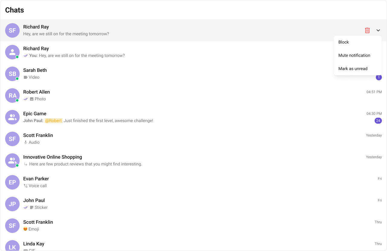
Options
- What you’re changing: Customize the context menu options for each conversation.
- File: Any React module
- Applies to:
options - Default behavior: Default menu actions.
- Override: Provide your own
CometChatOptionlist. - Verify: Custom options appear in the menu.
- TypeScript
- CSS
| Name | Description |
|---|---|
| id | Unique identifier for each option. |
| title | Display label for the option. |
| iconURL | Icon asset URL. |
| onClick | Handler invoked when the option is selected. |
Customization matrix
| What you want to change | Where | Property/API | Example |
|---|---|---|---|
| Handle item click | CometChatConversations | onItemClick | onItemClick={(c) => setActive(c)} |
| Enable multi-select | CometChatConversations | selectionMode | selectionMode={SelectionMode.multiple} |
| Filter conversations | CometChatConversations | conversationsRequestBuilder | new CometChat.ConversationsRequestBuilder().setLimit(10) |
| Custom list item | CometChatConversations | itemView | itemView={(c) => <MyItem />} |
| Custom header | CometChatConversations | headerView | headerView={myHeader} |
| Custom styles | Global CSS | .cometchat-conversations | .cometchat-conversations { ... } |
Common pitfalls and fixes
| Symptom | Cause | Fix |
|---|---|---|
| Component does not render | CometChatUIKit.init() not called or not awaited | Ensure init completes before rendering. |
| Component renders but shows no data | User not logged in | Call CometChatUIKit.login("UID") after init. |
onItemClick not firing | Wrong prop name | Use onItemClick. |
| Custom view not appearing | Returning null or undefined | Return valid JSX from view prop. |
| SSR hydration error | UI Kit uses browser APIs | Render in useEffect or use ssr: false in Next.js. |
| Conversations list empty after login | Filters too restrictive | Remove or adjust conversationsRequestBuilder. |
| Events not received | Listener not subscribed or unsubscribed early | Subscribe in useEffect and unsubscribe in cleanup. |
FAQ
Can I show only group conversations? Yes. UseconversationsRequestBuilder to filter by type.
How do I customize the list item layout?
Use itemView, leadingView, titleView, subtitleView, or trailingView.