Goal: Customize message bubble appearance (colors, backgrounds) per direction and message typeWhere: App.css (global) — import in app entry via import "./App.css";Base selector: .cometchat .cometchat-message-bubble-(incoming|outgoing) .cometchat-message-bubble__bodyType modifier: Append .cometchat-message-bubble__<TYPE>-message to target specific types (text, image, video, audio, file, delete, meeting, whiteboard, document, poll, sticker)Key tokens: --cometchat-primary-color (outgoing bg), --cometchat-neutral-color-300 (incoming bg), --cometchat-extended-primary-color-900 (outgoing shade)Constraints: Global CSS only (no CSS Modules), no !important, type selectors override generic bubble selectors Introduction We offer customizable message bubble styling to enhance user experience and match your app’s design. With distinct classes for incoming and outgoing messages, you can easily define colors, borders, and other styles. Each message type, from text to multimedia, has predefined classes for default styling, and developers can further customize using CSS.
Prerequisites before applying any CSS customization:
Import the base stylesheet: @import url("@cometchat/chat-uikit-react/css-variables.css"); in your App.css
Import your CSS file at the app entry: import "./App.css"; in App.tsx
All selectors assume the UI Kit renders under a .cometchat root wrapper
Use global CSS (not CSS Modules with hashed class names) — hashed selectors won’t match
Selector Pattern Use this table to construct the correct CSS selector for any message bubble target. AI agents should use this pattern to generalize — do not guess selectors.
Target Selector Pattern All bubbles .cometchat .cometchat-message-bubble .cometchat-message-bubble__bodyOutgoing bubbles (all types) .cometchat .cometchat-message-bubble-outgoing .cometchat-message-bubble__bodyIncoming bubbles (all types) .cometchat .cometchat-message-bubble-incoming .cometchat-message-bubble__bodySpecific type (outgoing) .cometchat .cometchat-message-bubble-outgoing .cometchat-message-bubble__body.cometchat-message-bubble__<TYPE>-messageSpecific type (incoming) .cometchat .cometchat-message-bubble-incoming .cometchat-message-bubble__body.cometchat-message-bubble__<TYPE>-messageAction bubbles (no direction) .cometchat .cometchat-message-bubble__body .cometchat-action-bubble
<TYPE><TYPE> is one of text, image, video, audio, file, delete, meeting (direct call), whiteboard, document, poll, sticker
Link Preview Bubbles It reuse the text-message type selector since link previews are rendered inside text messages.
CSS Variable Reference These are the CSS variables (tokens) used across message bubble styling. This table tells you exactly what each token controls — do not assume a token affects something not listed here.
Variable What It Controls Default (Light) Commonly Used On --cometchat-primary-colorOutgoing bubble background, primary accent #6852d6Outgoing bubbles (all types), action bubble accent --cometchat-neutral-color-300Incoming bubble background #fffIncoming bubbles (all types) --cometchat-extended-primary-color-900Outgoing bubble shade/gradient variant #5d49beOutgoing text bubble, link preview --cometchat-extended-primary-color-800Outgoing bubble secondary shade #5745b4Direct call outgoing bubble --cometchat-extended-primary-color-700Outgoing bubble tertiary shade #4f3ea3Poll outgoing bubble --cometchat-neutral-color-400Incoming bubble secondary shade varies Link preview incoming --cometchat-primary-button-backgroundPrimary button fill inside bubbles matches primary Whiteboard/document incoming buttons --cometchat-text-color-secondarySecondary/caption text color varies Action bubble text --cometchat-icon-color-secondarySecondary icon color varies Action bubble icons --cometchat-border-color-defaultDefault border color varies Action bubble borders
CSS Specificity & Precedence Rules:
Message-type selectors (e.g., __text-message) override “All Message Bubbles” selectors
Always keep the .cometchat prefix to avoid leaking styles into the host app
Component-level variable overrides (.cometchat-message-list { --var: val }) override global overrides (.cometchat { --var: val })
CSS variable overrides only affect properties the UI Kit theme binds to that variable — they do NOT change layout or spacing
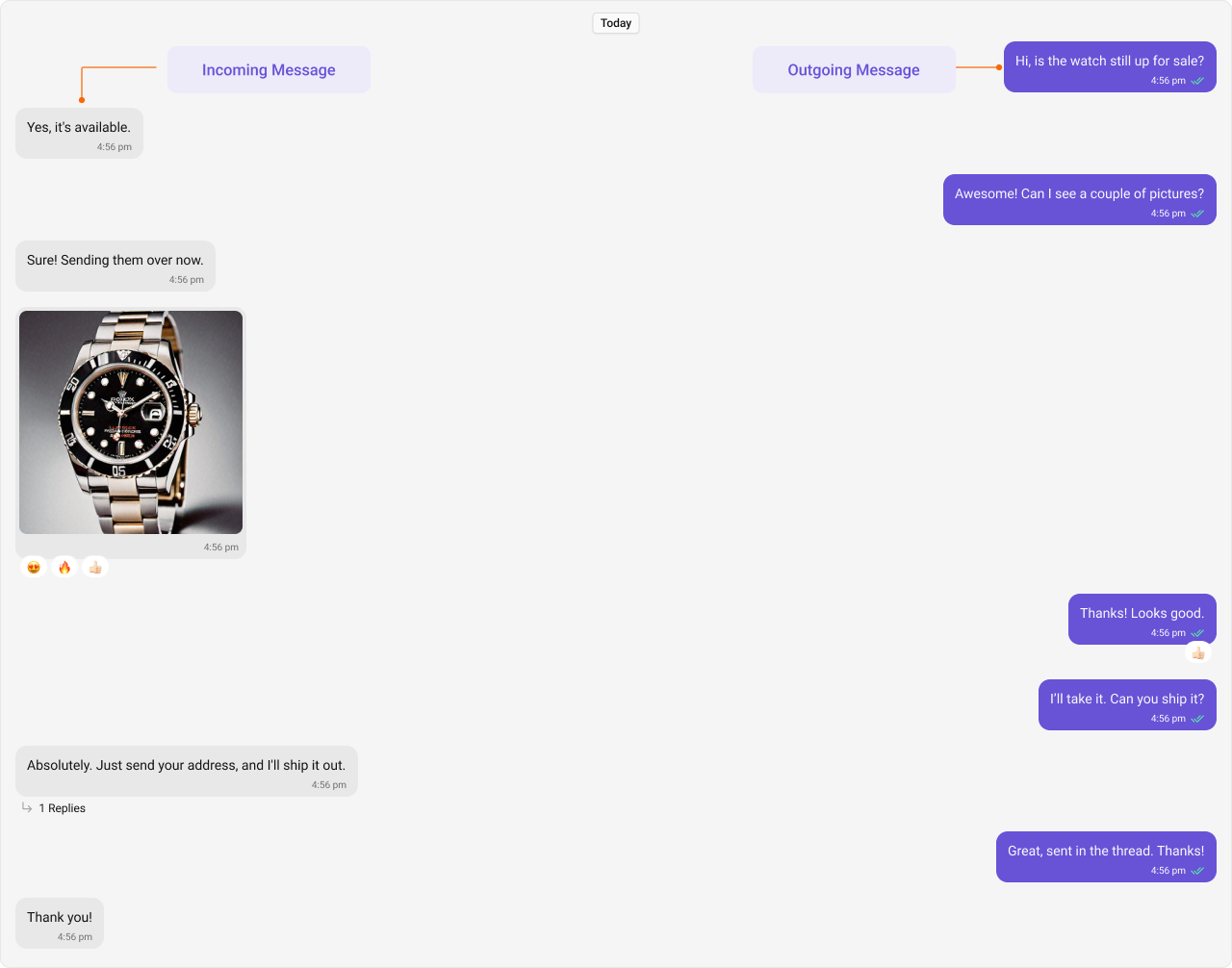
!important should never be needed — if it is, your selector specificity is wrong Incoming & Outgoing Messages Incoming and outgoing messages have different styling by default, allowing users to visually separate their own messages from others’. Here, we show both the default view and examples of customizations for these message bubbles.
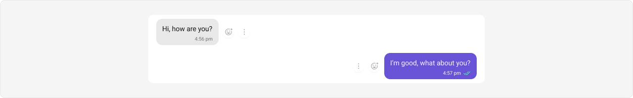
Shown below is the default chat interface.
Styling Outgoing Message Bubbles Selectors: .cometchat .cometchat-message-bubble-outgoing .cometchat-message-bubble__body
Tokens used: Token Controls --cometchat-primary-colorOutgoing bubble background --cometchat-extended-primary-color-900Outgoing bubble shade
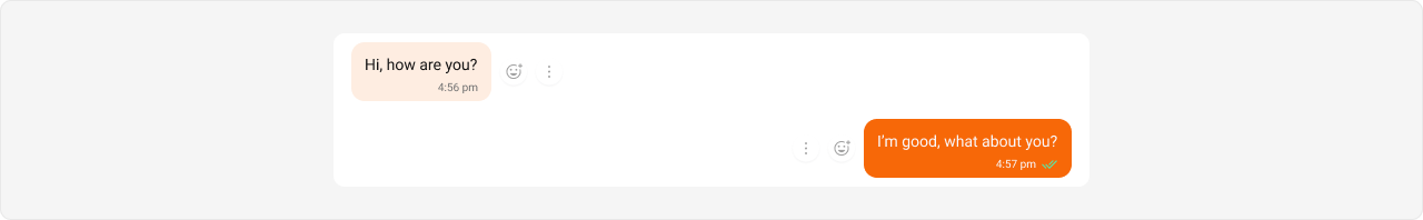
The customized chat interface is displayed below.
Use the following code to achieve the customization shown above.
.cometchat .cometchat-message-bubble-outgoing .cometchat-message-bubble__body { --cometchat-primary-color : #f76808 ; --cometchat-extended-primary-color-900 : #fbaa75 ; }
Expected result: All outgoing message bubbles change from purple to orange (#f76808) with a lighter orange shade (#fbaa75).Incoming Message Bubbles Selectors: .cometchat .cometchat-message-bubble-incoming .cometchat-message-bubble__body
Tokens used: Token Controls --cometchat-neutral-color-300Incoming bubble background
The customized chat interface is displayed below.
Use the following code to achieve the customization shown above.
.cometchat .cometchat-message-bubble-incoming .cometchat-message-bubble__body { --cometchat-neutral-color-300 : #f76808 ; }
Expected result: All incoming message bubbles change from white/light to orange (#f76808).All Message Bubbles Selectors: .cometchat .cometchat-message-bubble .cometchat-message-bubble__body
Tokens used: Token Controls --cometchat-neutral-color-300Incoming bubble background --cometchat-primary-colorOutgoing bubble background --cometchat-extended-primary-color-900Outgoing bubble shade
The customized chat interface is displayed below.
Use the following code to achieve the customization shown above.
.cometchat .cometchat-message-bubble .cometchat-message-bubble__body { --cometchat-neutral-color-300 : #f76808 ; --cometchat-primary-color : #f76808 ; --cometchat-extended-primary-color-900 : #fbaa75 ; }
Expected result: Both incoming and outgoing bubbles use orange (#f76808), with outgoing shade set to lighter orange (#fbaa75).Complete End-to-End Example To apply custom bubble colors in your app:
Step 1: Add to App.css:@import url ( "@cometchat/chat-uikit-react/css-variables.css" ); /* Custom outgoing bubbles */ .cometchat .cometchat-message-bubble-outgoing .cometchat-message-bubble__body { --cometchat-primary-color : #f76808 ; --cometchat-extended-primary-color-900 : #fbaa75 ; } /* Custom incoming bubbles */ .cometchat .cometchat-message-bubble-incoming .cometchat-message-bubble__body { --cometchat-neutral-color-300 : #feede1 ; }
Step 2: Ensure App.tsx imports the CSS:import "./App.css" ; // ... render CometChat UI Kit components
Expected result: Outgoing bubbles use orange (#f76808) with lighter shade (#fbaa75); incoming bubbles use light peach (#feede1).Message Types CometChat UI Kit includes classes for various message types. Below are examples of default & customised views for each message type, along with the relevant CSS code snippets so that you can quickly get up to speed with CSS customization.
Text Message Bubble Selectors: .cometchat .cometchat-message-bubble-outgoing .cometchat-message-bubble__body.cometchat-message-bubble__text-message
.cometchat .cometchat-message-bubble-incoming .cometchat-message-bubble__body.cometchat-message-bubble__text-message
Tokens used: Token Controls --cometchat-primary-colorOutgoing text bubble background --cometchat-neutral-color-300Incoming text bubble background
Shown below is the default chat interface.
The customized chat interface is displayed below.
Complete CSS: /* Outgoing Text Message Bubble */ .cometchat .cometchat-message-bubble-outgoing .cometchat-message-bubble__body.cometchat-message-bubble__text-message { --cometchat-primary-color : #f76808 ; } /* Incoming Text Message Bubble */ .cometchat .cometchat-message-bubble-incoming .cometchat-message-bubble__body.cometchat-message-bubble__text-message { --cometchat-neutral-color-300 : #feede1 ; }
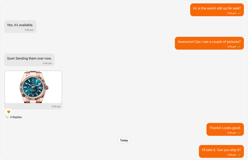
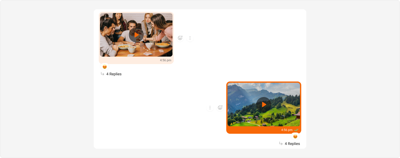
Expected result: Outgoing text bubbles change to orange (#f76808); incoming text bubbles change to light peach (#feede1).Image Message Bubble Selectors: .cometchat .cometchat-message-bubble-outgoing .cometchat-message-bubble__body.cometchat-message-bubble__image-message
.cometchat .cometchat-message-bubble-incoming .cometchat-message-bubble__body.cometchat-message-bubble__image-message
Tokens used: Token Controls --cometchat-primary-colorOutgoing image bubble background --cometchat-neutral-color-300Incoming image bubble background
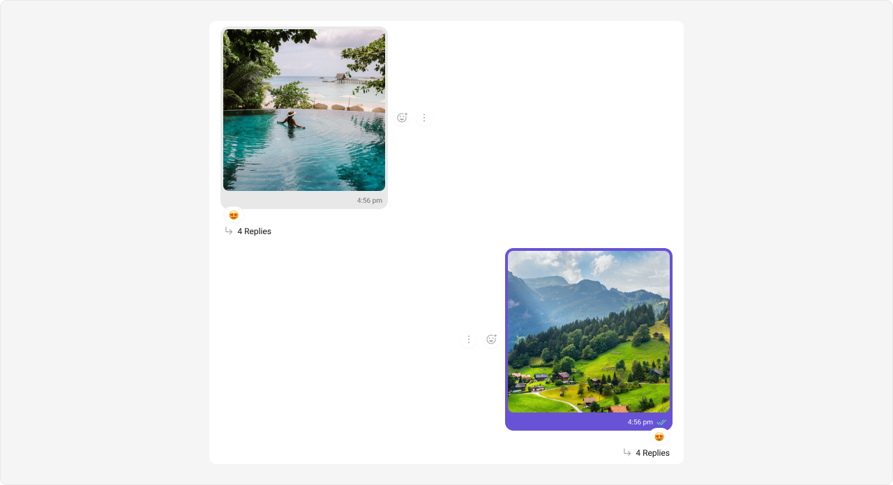
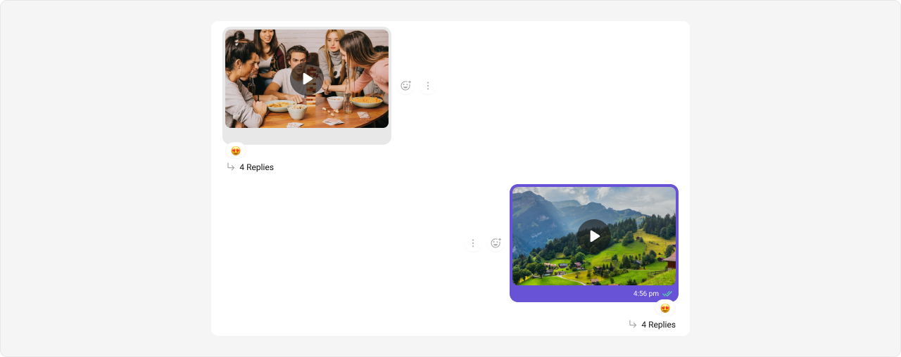
Shown below is the default chat interface.
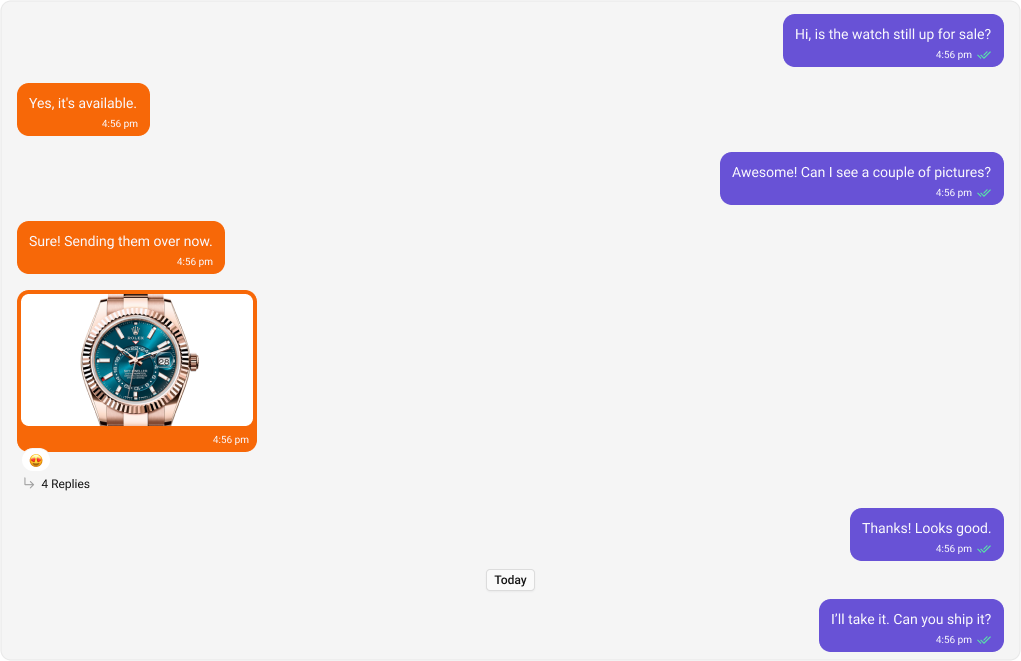
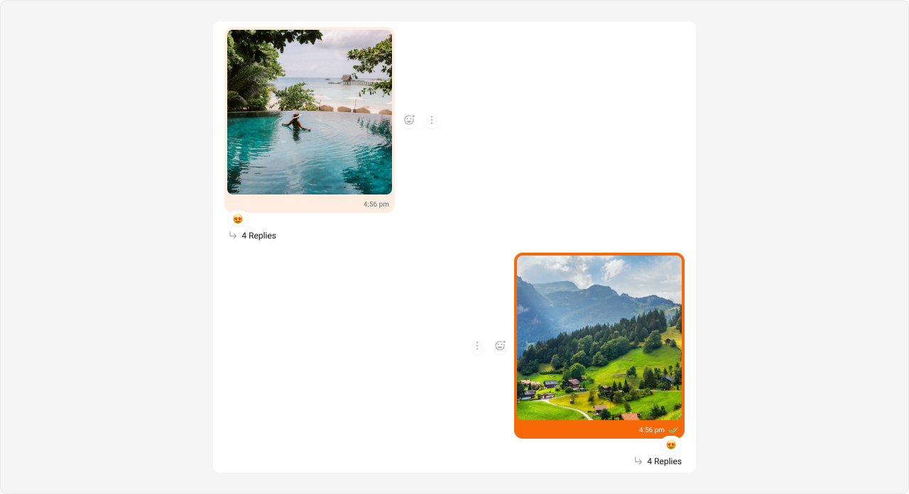
The customized chat interface is displayed below.
Complete CSS: /* Outgoing Image Message Bubble */ .cometchat .cometchat-message-bubble-outgoing .cometchat-message-bubble__body.cometchat-message-bubble__image-message { --cometchat-primary-color : #f76808 ; } /* Incoming Image Message Bubble */ .cometchat .cometchat-message-bubble-incoming .cometchat-message-bubble__body.cometchat-message-bubble__image-message { --cometchat-neutral-color-300 : #feede1 ; }
Expected result: Outgoing image bubbles change to orange (#f76808); incoming image bubbles change to light peach (#feede1).Video Message Bubble Selectors: .cometchat .cometchat-message-bubble-outgoing .cometchat-message-bubble__body.cometchat-message-bubble__video-message
.cometchat .cometchat-message-bubble-incoming .cometchat-message-bubble__body.cometchat-message-bubble__video-message
Tokens used: Token Controls --cometchat-primary-colorOutgoing video bubble background --cometchat-neutral-color-300Incoming video bubble background
Shown below is the default chat interface.
The customized chat interface is displayed below.
Complete CSS: /* Outgoing Video Message Bubble */ .cometchat .cometchat-message-bubble-outgoing .cometchat-message-bubble__body.cometchat-message-bubble__video-message { --cometchat-primary-color : #f76808 ; } /* Incoming Video Message Bubble */ .cometchat .cometchat-message-bubble-incoming .cometchat-message-bubble__body.cometchat-message-bubble__video-message { --cometchat-neutral-color-300 : #feede1 ; }
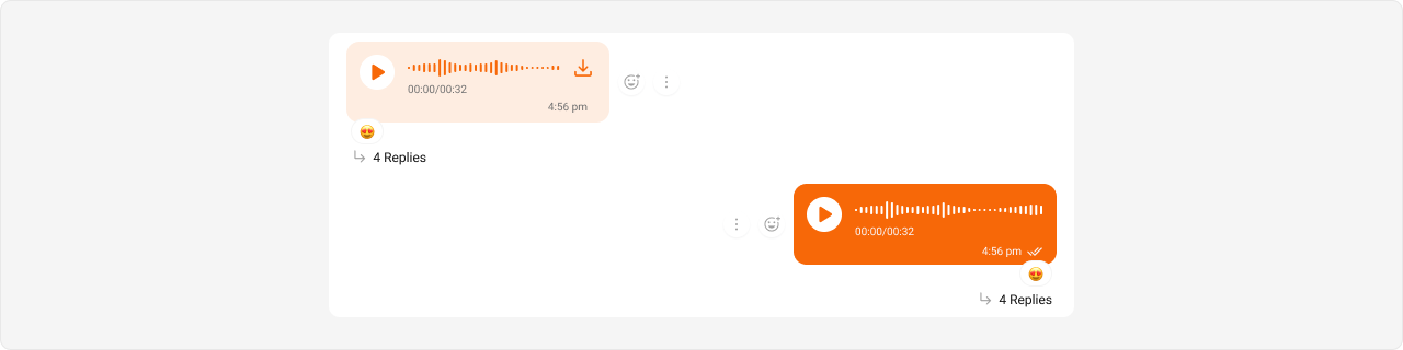
Expected result: Outgoing video bubbles change to orange (#f76808); incoming video bubbles change to light peach (#feede1).Audio Message Bubble Selectors: .cometchat .cometchat-message-bubble-outgoing .cometchat-message-bubble__body.cometchat-message-bubble__audio-message
.cometchat .cometchat-message-bubble-incoming .cometchat-message-bubble__body.cometchat-message-bubble__audio-message
Tokens used: Token Controls --cometchat-primary-colorOutgoing audio bubble background, incoming audio accent --cometchat-neutral-color-300Incoming audio bubble background
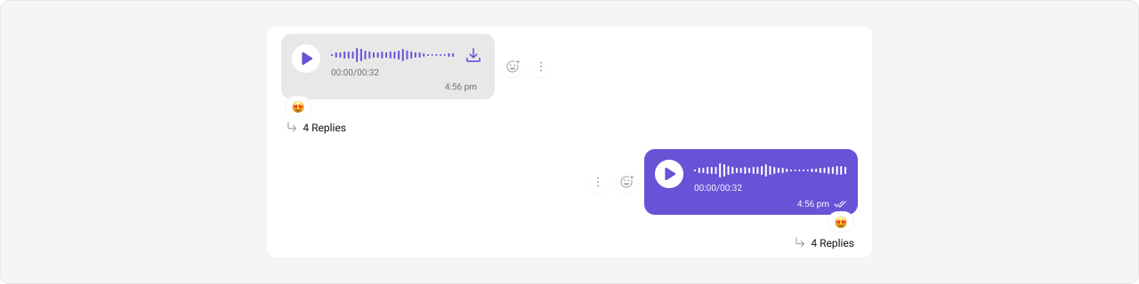
Shown below is the default chat interface.
The customized chat interface is displayed below.
Complete CSS: /* Outgoing Audio Message Bubble */ .cometchat .cometchat-message-bubble-outgoing .cometchat-message-bubble__body.cometchat-message-bubble__audio-message { --cometchat-primary-color : #f76808 ; } /* Incoming Audio Message Bubble */ .cometchat .cometchat-message-bubble-incoming .cometchat-message-bubble__body.cometchat-message-bubble__audio-message { --cometchat-primary-color : #f76808 ; --cometchat-neutral-color-300 : #feede1 ; }
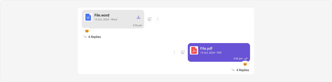
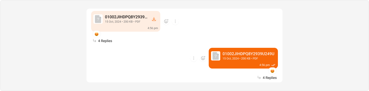
Expected result: Outgoing audio bubbles change to orange (#f76808); incoming audio bubbles change to light peach (#feede1) with orange accent for playback controls.File Message Bubble Selectors: .cometchat .cometchat-message-bubble-outgoing .cometchat-message-bubble__body.cometchat-message-bubble__file-message
.cometchat .cometchat-message-bubble-incoming .cometchat-message-bubble__body.cometchat-message-bubble__file-message
Tokens used: Token Controls --cometchat-primary-colorOutgoing file bubble background, incoming file accent --cometchat-neutral-color-300Incoming file bubble background
Shown below is the default chat interface.
The customized chat interface is displayed below.
Complete CSS: /* Outgoing File Message Bubble */ .cometchat .cometchat-message-bubble-outgoing .cometchat-message-bubble__body.cometchat-message-bubble__file-message { --cometchat-primary-color : #f76808 ; } /* Incoming File Message Bubble */ .cometchat .cometchat-message-bubble-incoming .cometchat-message-bubble__body.cometchat-message-bubble__file-message { --cometchat-primary-color : #f76808 ; --cometchat-neutral-color-300 : #feede1 ; }
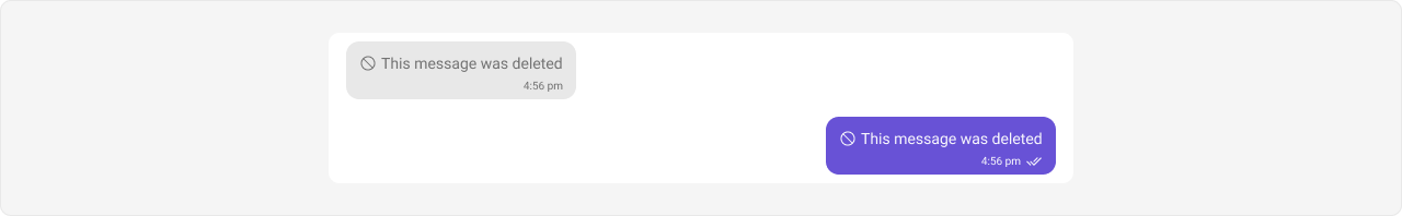
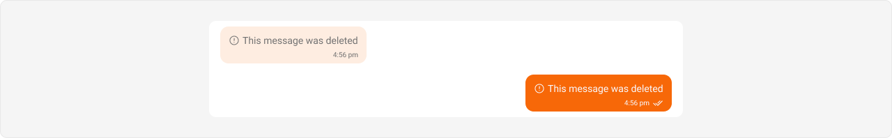
Expected result: Outgoing file bubbles change to orange (#f76808); incoming file bubbles change to light peach (#feede1) with orange file icon accent.Delete Message Bubble Selectors: .cometchat .cometchat-message-bubble-outgoing .cometchat-message-bubble__body.cometchat-message-bubble__delete-message
.cometchat .cometchat-message-bubble-incoming .cometchat-message-bubble__body.cometchat-message-bubble__delete-message
Tokens used: Token Controls --cometchat-primary-colorOutgoing delete bubble background --cometchat-neutral-color-300Incoming delete bubble background
Shown below is the default chat interface.
The customized chat interface is displayed below.
Complete CSS: /* Outgoing Delete Bubble */ .cometchat .cometchat-message-bubble-outgoing .cometchat-message-bubble__body.cometchat-message-bubble__delete-message { --cometchat-primary-color : #f76808 ; } /* Incoming Delete Bubble */ .cometchat .cometchat-message-bubble-incoming .cometchat-message-bubble__body.cometchat-message-bubble__delete-message { --cometchat-neutral-color-300 : #feede1 ; }
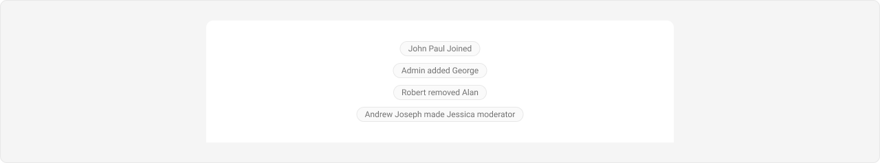
Expected result: Outgoing delete placeholder bubbles change to orange (#f76808); incoming delete placeholder bubbles change to light peach (#feede1).Action Message Bubble Action messages (e.g., “User joined the group”) use a different selector pattern — they are not directional (no incoming/outgoing).
Selector:
.cometchat .cometchat-message-bubble__body .cometchat-action-bubble
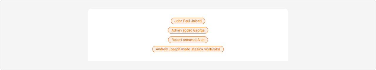
Tokens used: Token Controls --cometchat-primary-colorAction bubble accent color background-colorAction bubble background (direct CSS property, not a variable) --cometchat-text-color-secondaryAction bubble text color --cometchat-icon-color-secondaryAction bubble icon color --cometchat-border-color-defaultAction bubble border color
Shown below is the default chat interface.
The customized chat interface is displayed below.
Complete CSS: .cometchat .cometchat-message-bubble__body .cometchat-action-bubble { --cometchat-primary-color : #f76808 ; background-color : #feede1 ; --cometchat-text-color-secondary : #f76808 ; --cometchat-icon-color-secondary : #f76808 ; --cometchat-border-color-default : #f76808 ; }
Expected result: Action message banners change to light peach background (#feede1) with orange text, icons, and borders (#f76808).Direct Call Message Bubble Direct call messages use the meeting-message type selector (not call-message).
Selectors: .cometchat .cometchat-message-bubble-outgoing .cometchat-message-bubble__body.cometchat-message-bubble__meeting-message
.cometchat .cometchat-message-bubble-incoming .cometchat-message-bubble__body.cometchat-message-bubble__meeting-message
Tokens used: Token Controls --cometchat-primary-colorBubble accent and background --cometchat-extended-primary-color-800Outgoing bubble secondary shade --cometchat-neutral-color-300Incoming bubble background
Shown below is the default chat interface.
The customized chat interface is displayed below.
Complete CSS: /* Outgoing Direct Call Message Bubble */ .cometchat .cometchat-message-bubble-outgoing .cometchat-message-bubble__body.cometchat-message-bubble__meeting-message { --cometchat-primary-color : #f76808 ; --cometchat-extended-primary-color-800 : #fbaa75 ; } /* Incoming Direct Call Message Bubble */ .cometchat .cometchat-message-bubble-incoming .cometchat-message-bubble__body.cometchat-message-bubble__meeting-message { --cometchat-primary-color : #f76808 ; --cometchat-neutral-color-300 : #feede1 ; }
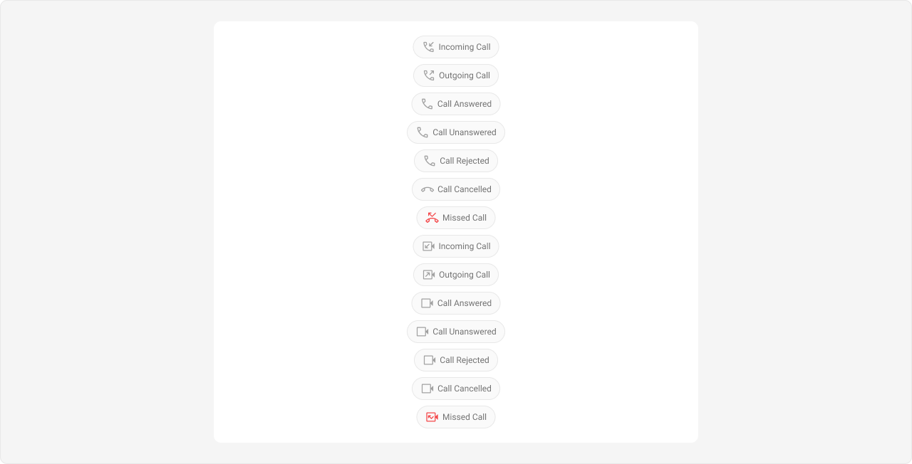
Expected result: Outgoing direct call bubbles change to orange (#f76808) with lighter shade (#fbaa75); incoming direct call bubbles change to light peach (#feede1) with orange accent.Default Call Message Bubble Default call messages (ringing calls) use the same action bubble selector as Action Messages.
Selector:
.cometchat .cometchat-message-bubble__body .cometchat-action-bubble
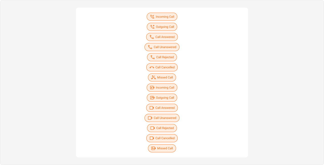
Tokens used: Token Controls --cometchat-primary-colorCall action bubble accent background-colorCall action bubble background (direct CSS property) --cometchat-text-color-secondaryCall action text color --cometchat-icon-color-secondaryCall action icon color --cometchat-border-color-defaultCall action border color
Styling default call message bubbles also affects Action Message bubbles since they share the same .cometchat-action-bubble selector. To style them independently, use more specific parent selectors if available.
Shown below is the default chat interface.
The customized chat interface is displayed below.
Complete CSS: .cometchat .cometchat-message-bubble__body .cometchat-action-bubble { --cometchat-primary-color : #f76808 ; background-color : #feede1 ; --cometchat-text-color-secondary : #f76808 ; --cometchat-icon-color-secondary : #f76808 ; --cometchat-border-color-default : #f76808 ; }
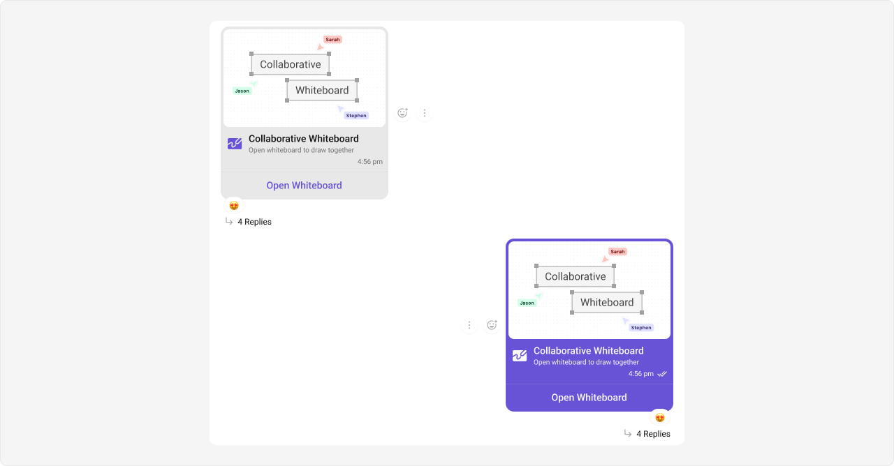
Expected result: Default call action banners change to light peach background (#feede1) with orange text, icons, and borders (#f76808).Extensions Collaborative Whiteboard Bubble Selectors: .cometchat .cometchat-message-bubble-outgoing .cometchat-message-bubble__body.cometchat-message-bubble__whiteboard-message
.cometchat .cometchat-message-bubble-incoming .cometchat-message-bubble__body.cometchat-message-bubble__whiteboard-message
Tokens used: Token Controls --cometchat-primary-colorBubble accent and background --cometchat-primary-button-backgroundIncoming whiteboard “Open” button fill --cometchat-neutral-color-300Incoming bubble background
Shown below is the default chat interface.
The customized chat interface is displayed below.
Complete CSS: /* Outgoing Collaborative Whiteboard Bubble */ .cometchat .cometchat-message-bubble-outgoing .cometchat-message-bubble__body.cometchat-message-bubble__whiteboard-message { --cometchat-primary-color : #f76808 ; } /* Incoming Collaborative Whiteboard Bubble */ .cometchat .cometchat-message-bubble-incoming .cometchat-message-bubble__body.cometchat-message-bubble__whiteboard-message { --cometchat-primary-color : #f76808 ; --cometchat-primary-button-background : #f76808 ; --cometchat-neutral-color-300 : #feede1 ; }
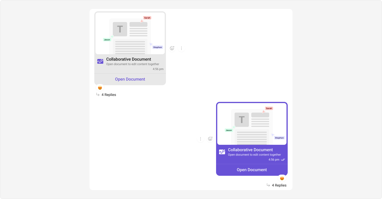
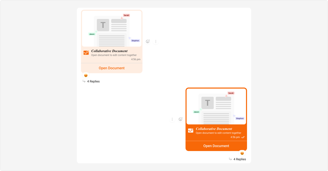
Expected result: Outgoing whiteboard bubbles change to orange (#f76808); incoming whiteboard bubbles change to light peach (#feede1) with orange button and accent.Collaborative Document Bubble Selectors: .cometchat .cometchat-message-bubble-outgoing .cometchat-message-bubble__body.cometchat-message-bubble__document-message
.cometchat .cometchat-message-bubble-incoming .cometchat-message-bubble__body.cometchat-message-bubble__document-message
Tokens used: Token Controls --cometchat-primary-colorBubble accent and background --cometchat-primary-button-backgroundIncoming document “Open” button fill --cometchat-neutral-color-300Incoming bubble background
Shown below is the default chat interface.
The customized chat interface is displayed below.
Complete CSS: /* Outgoing Collaborative Document Bubble */ .cometchat .cometchat-message-bubble-outgoing .cometchat-message-bubble__body.cometchat-message-bubble__document-message { --cometchat-primary-color : #f76808 ; } /* Incoming Collaborative Document Bubble */ .cometchat .cometchat-message-bubble-incoming .cometchat-message-bubble__body.cometchat-message-bubble__document-message { --cometchat-primary-color : #f76808 ; --cometchat-primary-button-background : #f76808 ; --cometchat-neutral-color-300 : #feede1 ; }
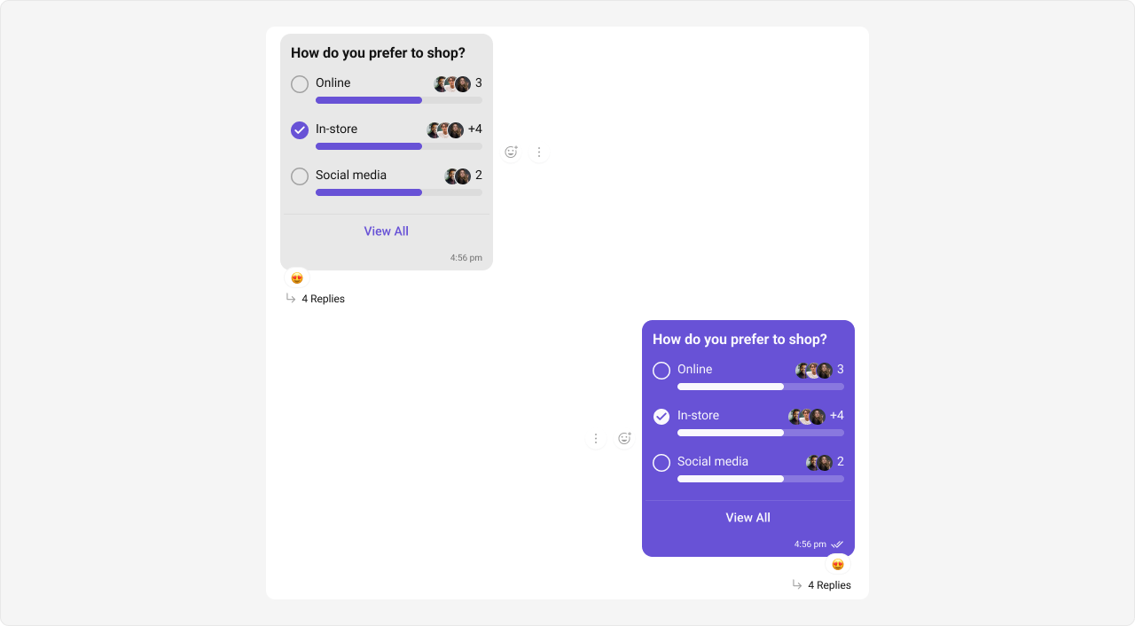
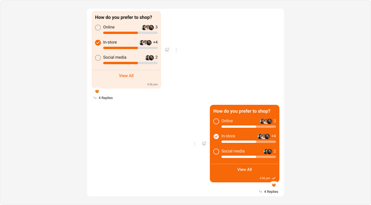
Expected result: Outgoing document bubbles change to orange (#f76808); incoming document bubbles change to light peach (#feede1) with orange button and accent.Polls Bubble Selectors: .cometchat .cometchat-message-bubble-outgoing .cometchat-message-bubble__body.cometchat-message-bubble__poll-message
.cometchat .cometchat-message-bubble-incoming .cometchat-message-bubble__body.cometchat-message-bubble__poll-message
Tokens used: Token Controls --cometchat-primary-colorBubble accent and background --cometchat-extended-primary-color-700Outgoing poll progress bar shade --cometchat-neutral-color-300Incoming bubble background
Shown below is the default chat interface.
The customized chat interface is displayed below.
Complete CSS: /* Outgoing Poll Message Bubble */ .cometchat .cometchat-message-bubble-outgoing .cometchat-message-bubble__body.cometchat-message-bubble__poll-message { --cometchat-primary-color : #f76808 ; --cometchat-extended-primary-color-700 : #fbaa75 ; } /* Incoming Poll Message Bubble */ .cometchat .cometchat-message-bubble-incoming .cometchat-message-bubble__body.cometchat-message-bubble__poll-message { --cometchat-primary-color : #f76808 ; --cometchat-neutral-color-300 : #feede1 ; }
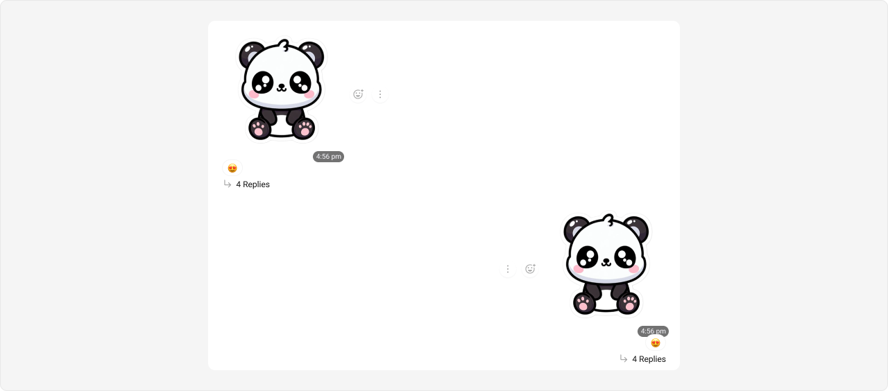
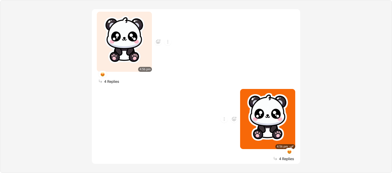
Expected result: Outgoing poll bubbles change to orange (#f76808) with lighter progress bars (#fbaa75); incoming poll bubbles change to light peach (#feede1) with orange accent.Stickers Bubble Selectors: .cometchat .cometchat-message-bubble-outgoing .cometchat-message-bubble__body.cometchat-message-bubble__sticker-message
.cometchat .cometchat-message-bubble-incoming .cometchat-message-bubble__body.cometchat-message-bubble__sticker-message
Tokens used: Token Controls --cometchat-primary-colorOutgoing sticker bubble background --cometchat-neutral-color-300Incoming sticker bubble background
Shown below is the default chat interface.
The customized chat interface is displayed below.
Complete CSS: /* Outgoing Sticker Bubble */ .cometchat .cometchat-message-bubble-outgoing .cometchat-message-bubble__body.cometchat-message-bubble__sticker-message { --cometchat-primary-color : #f76808 ; } /* Incoming Sticker Bubble */ .cometchat .cometchat-message-bubble-incoming .cometchat-message-bubble__body.cometchat-message-bubble__sticker-message { --cometchat-neutral-color-300 : #feede1 ; }
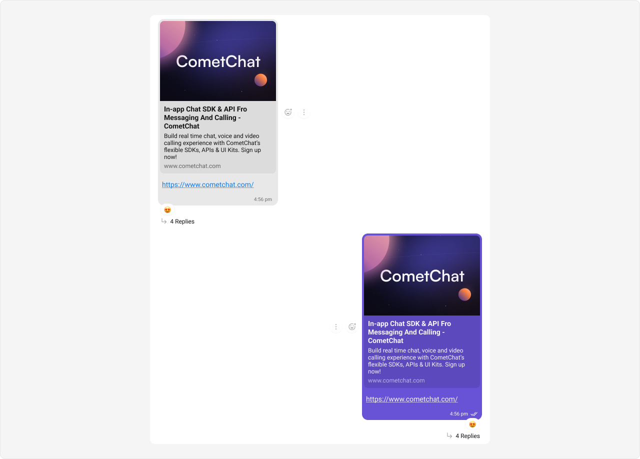
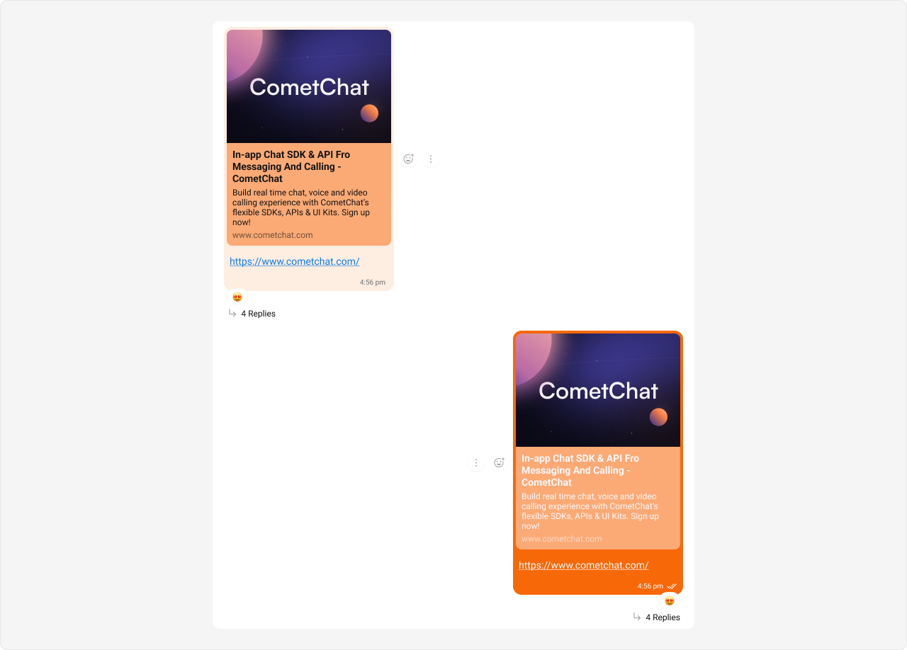
Expected result: Outgoing sticker bubbles change to orange (#f76808); incoming sticker bubbles change to light peach (#feede1).Link Preview Bubble Link previews render inside text message bubbles, so they use the text-message type selector.
Selectors: .cometchat .cometchat-message-bubble-outgoing .cometchat-message-bubble__body.cometchat-message-bubble__text-message
.cometchat .cometchat-message-bubble-incoming .cometchat-message-bubble__body.cometchat-message-bubble__text-message
Tokens used: Token Controls --cometchat-primary-colorOutgoing link preview bubble background --cometchat-extended-primary-color-900Outgoing link preview shade --cometchat-neutral-color-400Incoming link preview secondary shade --cometchat-neutral-color-300Incoming link preview bubble background
Styling link preview bubbles also affects regular text message bubbles since they share the same __text-message selector. This is by design — link previews are a sub-feature of text messages.
Shown below is the default chat interface.
The customized chat interface is displayed below.
Complete CSS: /* Outgoing Link Preview Bubble */ .cometchat .cometchat-message-bubble-outgoing .cometchat-message-bubble__body.cometchat-message-bubble__text-message { --cometchat-primary-color : #f76808 ; --cometchat-extended-primary-color-900 : #fbaa75 ; } /* Incoming Link Preview Bubble */ .cometchat .cometchat-message-bubble-incoming .cometchat-message-bubble__body.cometchat-message-bubble__text-message { --cometchat-neutral-color-400 : #fbaa75 ; --cometchat-neutral-color-300 : #feede1 ; }
Expected result: Outgoing link preview bubbles change to orange (#f76808) with lighter shade (#fbaa75); incoming link preview bubbles change to light peach (#feede1) with orange secondary shade (#fbaa75).Common Failure Modes
Troubleshooting: CSS Not Working
Symptom Cause Fix CSS has no effect CSS file not imported in app entry Add import "./App.css"; in App.tsx CSS has no effect Base stylesheet not imported Add @import url("@cometchat/chat-uikit-react/css-variables.css"); at top of App.css Selectors don’t match Using CSS Modules (hashed class names) Move rules to a global stylesheet, not *.module.css Selectors don’t match Missing .cometchat wrapper or different mount container Ensure UI Kit renders inside a .cometchat ancestor Wrong bubble styled Used __text-message instead of __image-message (or vice versa) Check the message type class suffix in the Selector Pattern table above Token change has no visible effect Token doesn’t control the property you expect Check the CSS Variable Reference table for what each token controls Styles leak into host app Missing .cometchat scope prefix Always scope selectors under .cometchat Dark mode looks wrong Overriding light-mode tokens without dark-mode equivalents Override tokens in both .cometchat and .cometchat[data-theme="dark"] Action and Default Call bubbles styled together Both use .cometchat-action-bubble selector This is expected — they share the same selector. Use more specific parent selectors if you need to differentiate Link preview styled but text messages also changed Both use __text-message selector This is expected — link previews are rendered inside text messages
Next Steps 