AI Agent Component Spec
AI Agent Component Spec
- Goal: Override UI Kit color tokens to match your brand
- Where:
App.css(global) — import in app entry viaimport "./App.css"; - Scope: Override variables on
.cometchat(global) or.cometchat-<component>(component-specific) - Key tokens:
--cometchat-primary-color(brand/accent),--cometchat-neutral-color-300(incoming bubbles),--cometchat-background-color-01(main background) - Dark mode: Override in
.cometchat[data-theme="dark"]selector - Source file: css-variables.css on GitHub
- Constraints: Global CSS only (no CSS Modules), no
!important, component-level overrides take precedence over global
Introduction
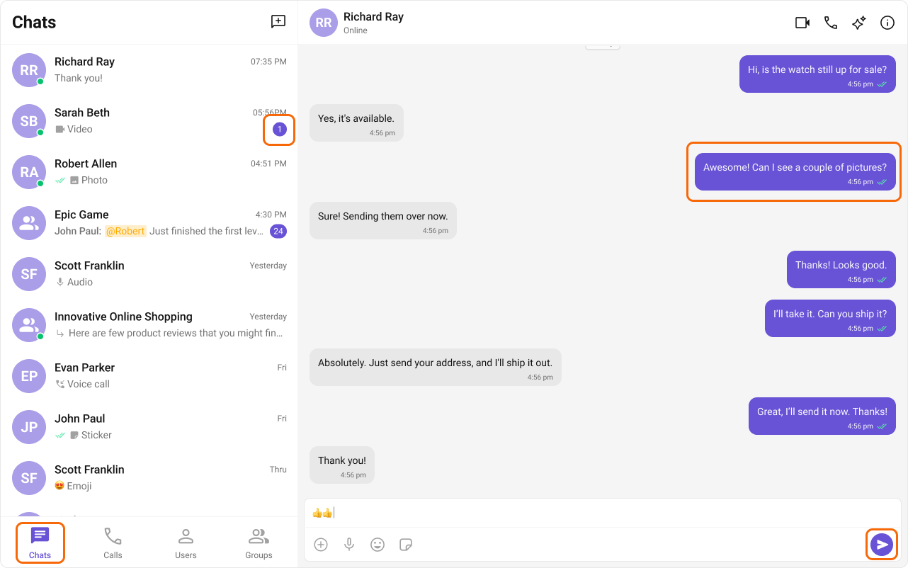
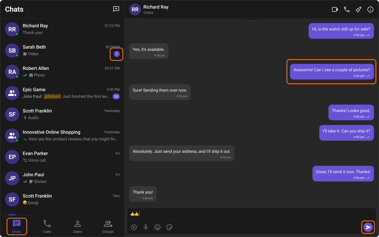
The Chat UI Kit features a carefully crafted color palette designed for a consistent and visually appealing user experience. It follows the Block, Element, Modifier (BEM) methodology, ensuring scalable styling and easy customization by overriding the Kit’s CSS variables.Agent Guardrails (Use These Rules)
- Use the snippets exactly as shown; only change token values.
- Keep
.cometchatand.cometchat-conversationsintact — these are the tested selectors. - Keep overrides in global CSS (
App.css), not CSS Modules. - Dark mode examples assume
data-themeis set on.cometchat. If you setdata-themeelsewhere, update the selector to match.
Selector Contract
Use these patterns when overriding colors. This is the canonical selector contract for this page. Global overridedata-theme to a wrapper instead of .cometchat, scope the selector to match your DOM structure.
CSS Variable Reference
This table maps every commonly used token to what it visually controls. Use this to avoid hallucinating what a token does.| Variable | What It Controls | Default (Light) | Used By |
|---|---|---|---|
--cometchat-primary-color | Brand accent, outgoing bubble bg, active states, links, buttons | #6852d6 | Outgoing bubbles, send button, active tabs, links |
--cometchat-neutral-color-300 | Incoming bubble background | #fff | Incoming message bubbles |
--cometchat-neutral-color-400 | Secondary backgrounds, dividers | varies | Borders, secondary panels |
--cometchat-neutral-color-500 | Muted text, placeholders | varies | Placeholder text, disabled states |
--cometchat-neutral-color-600 | Secondary text | varies | Timestamps, subtitles |
--cometchat-neutral-color-700 | Primary text | varies | Main body text |
--cometchat-neutral-color-800 | Headings, strong text | varies | Component titles, names |
--cometchat-background-color-01 | Main app background | #fff | Root container background |
--cometchat-background-color-02 | Secondary/panel background | varies | Sidebars, panels |
--cometchat-background-color-03 | Tertiary background | varies | Nested panels, cards |
--cometchat-extended-primary-color-50 through 900 | Primary color scale (lightest to darkest) | See palette below | Hover states, gradients, shades |
--cometchat-font-family | All text in UI Kit | system default | Global typography |
--cometchat-text-color-highlight | Highlighted/linked text | matches primary | Links, mentions, highlights |
--cometchat-icon-color-highlight | Highlighted icon color | matches primary | Active icons, selected states |
--cometchat-text-color-secondary | Secondary/caption text | varies | Timestamps, subtitles, captions |
--cometchat-icon-color-secondary | Secondary icon color | varies | Inactive icons |
--cometchat-primary-button-background | Primary button fill | matches primary | Send button, action buttons |
--cometchat-border-color-default | Default border color | varies | Dividers, input borders |
--cometchat-error-color | Error states | #f44336 | Error messages, validation |
--cometchat-success-color | Success states | #4caf50 | Online indicators, success messages |
--cometchat-warning-color | Warning states | #ff9800 | Warning callouts |
CSS Specificity & Precedence Rules:
- Component-level overrides (
.cometchat-conversations { --var: val }) take precedence over global overrides (.cometchat { --var: val }) - Dark mode overrides (
.cometchat[data-theme="dark"]) take precedence over light mode defaults - CSS variable overrides only affect properties the UI Kit theme binds to that variable — they do NOT change layout or spacing
- Always keep the
.cometchatprefix to avoid leaking styles into the host app !importantshould never be needed — if it is, your selector specificity is wrong
Color Palette
The primary color defines key actions, branding, and UI elements, while the extended primary palette provides variations for supporting components.Primary Color
Light Mode
Dark Mode
Extended Primary Colors
Light Mode
Dark Mode
Complete End-to-End Example: Custom Brand Colors
Step 1: Add toApp.css:
App.tsx imports the CSS:
Common Failure Modes
Troubleshooting: Color Overrides Not Working
Troubleshooting: Color Overrides Not Working
| Symptom | Cause | Fix |
|---|---|---|
| CSS has no effect | CSS file not imported in app entry | Add import "./App.css"; in App.tsx |
| CSS has no effect | Base stylesheet not imported | Add @import url("@cometchat/chat-uikit-react/css-variables.css"); at top of App.css |
| Selectors don’t match | Using CSS Modules (hashed class names) | Move rules to a global stylesheet, not *.module.css |
| Only some elements changed color | Only overrode --cometchat-primary-color but not extended palette | Override the extended-primary-color scale too for full consistency |
| Dark mode unchanged | Only overrode light mode tokens | Add overrides in .cometchat[data-theme="dark"] selector too |
| Component-level override not working | Selector specificity too low | Use .cometchat .cometchat-<component> for higher specificity |
| Styles leak into host app | Missing .cometchat scope prefix | Always scope overrides under .cometchat |
| Token change has no visible effect | Token doesn’t control the property you expect | Check the CSS Variable Reference table above |
Next Steps
Theming Overview
Global theming with CSS variables, fonts, and component-specific overrides
Message Bubble Styling
Customize incoming and outgoing message bubble colors per message type
Components Overview
Browse all available UI Kit components and their customization options
CSS Variables Source
View the complete CSS variables file on GitHub